
Embark on a transformative journey through our comprehensive data analytics course, where you’ll leverage the power of ChatGPT alongside Microsoft Excel to build a solid foundation in data analytics course. This course is tailored for beginners and will equip you with the essential skills and functions necessary to analyze and present data effectively.
Step 1: Understanding Data Analytics 📊
Data analytics is a field that combines statistical analysis, data mining, and predictive modeling to extract insights from data. It helps organizations make informed decisions based on trends and patterns identified in their data sets.
At its core, data analytics involves two main components: data and analytics. Understanding these components is crucial for mastering the concepts taught in a data analytics course.
Why is Data Analytics Important?
- Informed Decision-Making: Businesses can make data-driven decisions rather than relying on intuition.
- Improved Efficiency: Identifying inefficiencies can lead to better resource allocation.
- Competitive Advantage: Leveraging data analytics can provide insights that keep organizations ahead of competitors.
Step 2: What is Data? 📈
Data is essentially information that is collected and stored for analysis. It can take various forms, including numbers, text, images, and more. In the context of data analytics, data is often categorized into two types: structured and unstructured.
Types of Data
- Structured Data: This type of data is organized and easily searchable, often found in databases and spreadsheets.
- Unstructured Data: This data lacks a predefined format and is more challenging to analyze, such as social media posts, emails, and videos.
Step 3: What is Analytics? 📊
Analytics refers to the systematic computational analysis of data. It involves using mathematical and statistical techniques to uncover patterns, correlations, and trends within data sets.
In a data analytics course, you’ll learn various analytical techniques, including descriptive, diagnostic, predictive, and prescriptive analytics.
Types of Analytics
- Descriptive Analytics: Summarizes past data to understand what has happened.
- Diagnostic Analytics: Focuses on understanding why something happened by analyzing data patterns.
- Predictive Analytics: Uses historical data to forecast future outcomes.
- Prescriptive Analytics: Suggests actions based on data analysis to achieve desired outcomes.
Step 4: The Data Analytics Process 🔍
The data analytics process is a systematic approach that involves several steps to convert raw data into meaningful insights. Understanding this process is fundamental for anyone looking to excel in a data analytics course.
Key Steps in the Data Analytics Process
- Data Collection: Gathering relevant data from various sources.
- Data Cleaning: Removing inaccuracies and inconsistencies from data sets.
- Data Analysis: Applying analytical techniques to interpret the data.
- Data Visualization: Presenting the findings in an understandable format, such as charts or graphs.
- Decision Making: Using the insights gained to inform business strategies and actions.
Step 5: Getting Started with Microsoft Excel 📊
Microsoft Excel is a powerful tool for data analysis that allows users to organize, analyze, and visualize data effectively. It is widely used in various industries for its versatility and user-friendly interface.
Essential Excel Functions for Data Analytics
- SUM: Adds up a range of numbers.
- AVERAGE: Calculates the average of a set of values.
- VLOOKUP: Searches for a value in the first column of a range and returns a value in the same row from another column.
- PIVOT TABLE: Summarizes data and allows for easy data manipulation.
Getting Excel
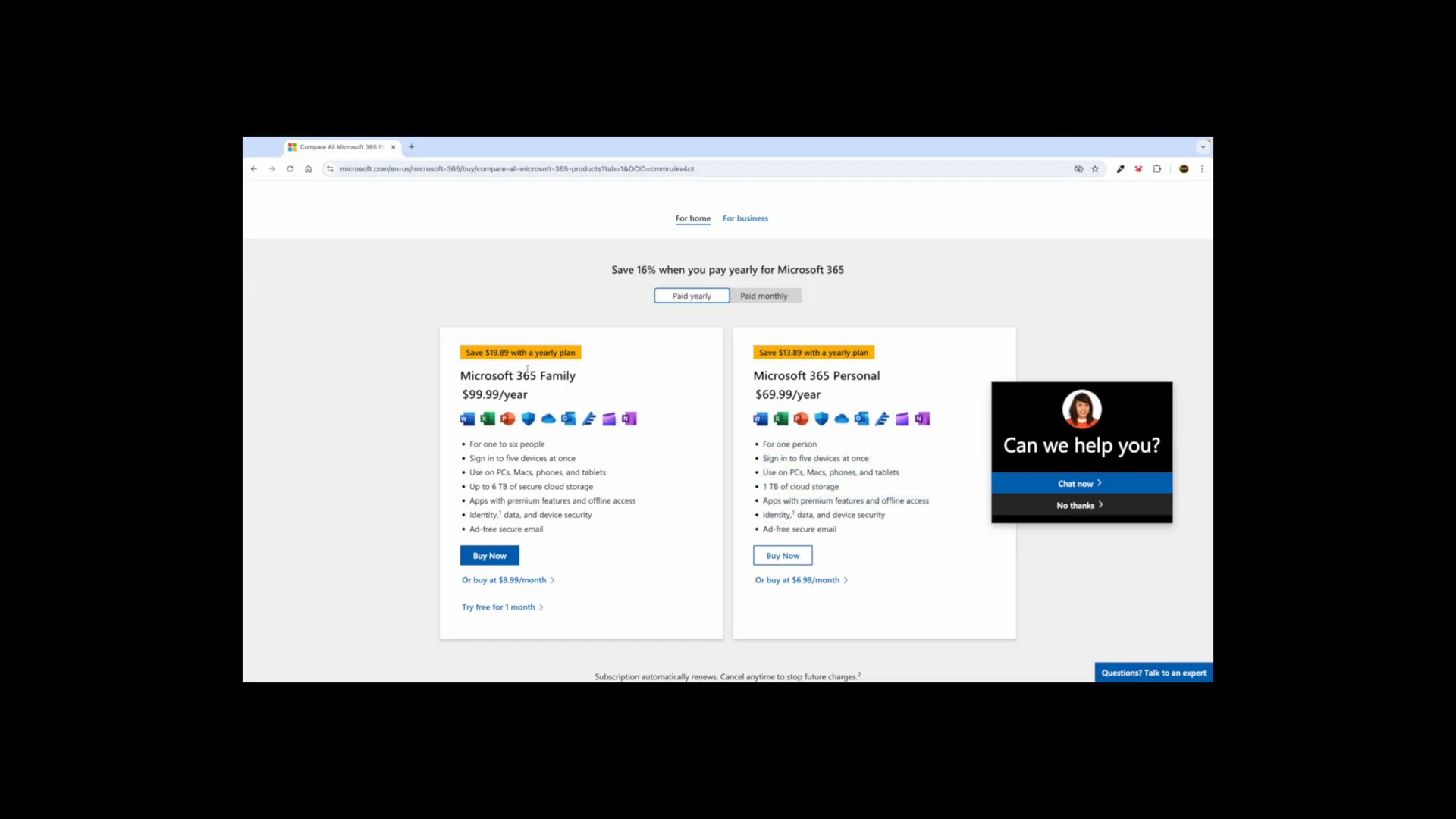
If you don’t have Microsoft Excel, you can easily obtain it by visiting the official Microsoft 365 website. Follow these steps:
- Search for “Microsoft 365” in your web browser.
- Click on the link to the official site.
- Select the option to get Microsoft 365 and follow the installation prompts.
With Excel, you can start practicing the techniques learned in your data analytics course, allowing you to apply your theoretical knowledge to practical scenarios.
Step 6: Installing Microsoft Excel and Alternatives 🖥️
To begin your journey in data analytics, the first step is to install Microsoft Excel. If you don’t have it yet, here’s how to get it:
- Visit the Microsoft 365 website.
- Choose your subscription plan. The Family Plan can be shared with up to six people, making it cost-effective.
- Follow the installation prompts to download the software on your PC, Mac, or tablet.
Alternatively, Google Sheets is a free option. All you need is a Google account. Simply sign in and access Google Sheets through your Google Drive.
- Open Google Chrome.
- Sign up or log in to your Google account.
- Click on the Sheets option from the Google apps menu.
Both applications offer similar functionalities for data analytics. You can choose based on your personal preferences or budget constraints.
Step 7: Basics of Excel for Data Analytics 📊
Once you have installed Excel, it’s time to familiarize yourself with its interface. Understanding the basics is crucial for effective data analysis.
Excel Interface Overview
- Ribbon: Contains various tabs like Home, Insert, Page Layout, and Data, which house different tools and functions.
- Worksheet: The main area where data is entered and manipulated in rows and columns.
- Formula Bar: Displays the contents of the selected cell and allows you to enter or edit data.

To zoom in or out, use the zoom slider located in the bottom right corner. This will help you view your data more clearly.
Step 8: Creating Tables in Excel 📋
Creating tables is fundamental for organizing your data in Excel. Tables allow for better data management and analysis.
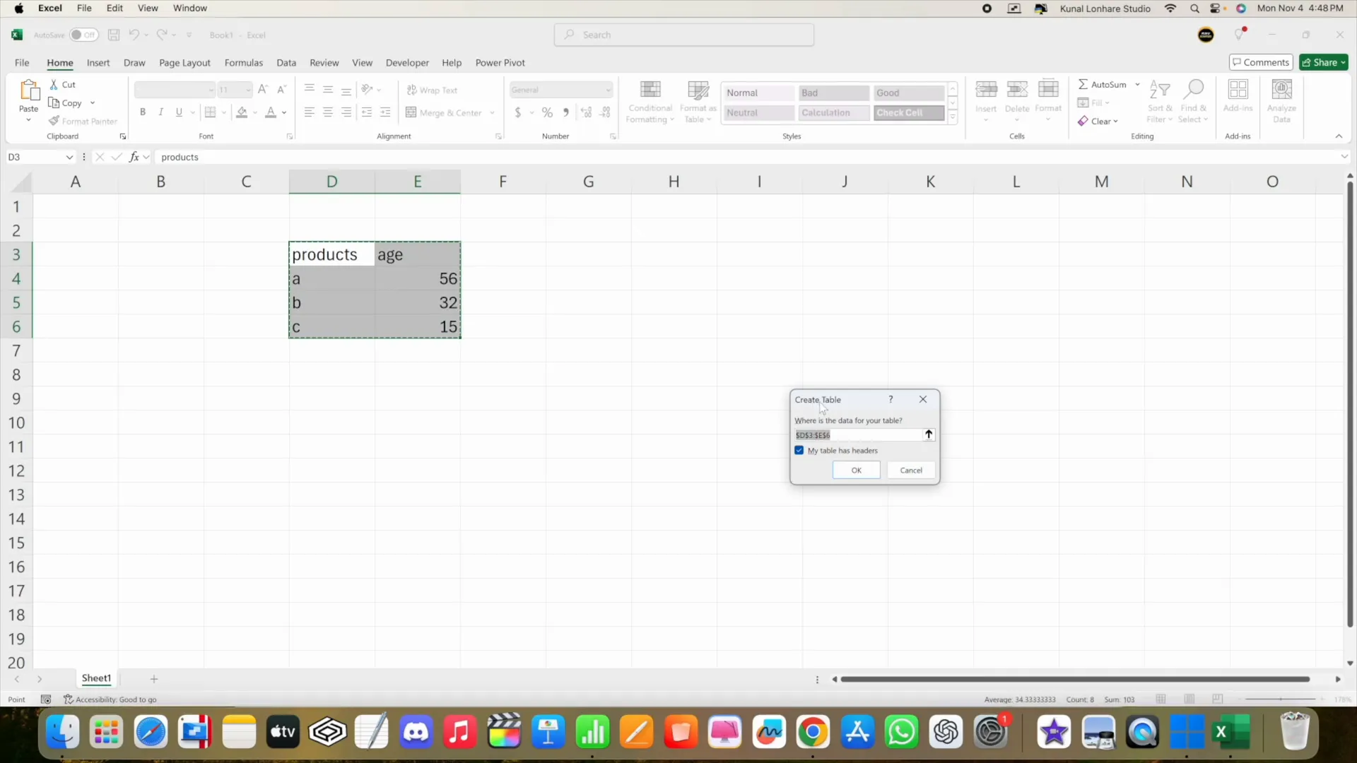
How to Create a Table
- Select the range of data you want to include in the table.
- Press Ctrl + T on your keyboard.
- In the Create Table dialog, ensure the “My table has headers” option is checked if your data includes headers.
- Click OK to create the table.
Once your table is created, you can use the Table Design tab to customize its appearance and functionality, making your data easier to read and analyze.
Step 9: Using Functions and Formulas 🔢
Excel’s true power lies in its ability to perform calculations through functions and formulas. Learning how to use them effectively will enhance your data analytics skills.
Commonly Used Functions
- SUM: Adds a range of numbers.
- AVERAGE: Calculates the average of a set of values.
- COUNT: Counts the number of cells that contain numbers.
- IF: Performs a logical test and returns one value for a TRUE result and another for a FALSE result.
To enter a formula, click on the desired cell and type = followed by the function name and its arguments. For example, =SUM(A1:A10) will sum all values from cell A1 to A10.
Step 10: Data Cleaning Techniques 🧹
Data cleaning is a vital step in data analytics. It ensures that the data is accurate, consistent, and usable. Here are some techniques to help you clean your data in Excel:
Common Data Cleaning Techniques
- Removing Duplicates: Use the Remove Duplicates feature in the Data tab to eliminate duplicate entries.
- Text to Columns: Split data in a single column into multiple columns based on a delimiter, such as a comma or space.
- Data Validation: Set rules to restrict the type of data entered in a cell, ensuring data integrity.
- Conditional Formatting: Highlight specific data points based on conditions to easily identify trends or outliers.
Implementing these techniques will significantly enhance the quality of your data and, consequently, the insights derived from your analysis.
Step 11: Conditional Formatting and Data Validation 🎨
Conditional formatting is a powerful feature in Excel that allows you to apply specific formatting to cells based on certain conditions. This means you can visually highlight data points that meet specific criteria, making it easier to analyze trends and patterns.
For instance, you can highlight the top three highest values in a dataset with a red color. To do this, select the data range, navigate to the “Conditional Formatting” option in the Home tab, and select “Top/Bottom Rules.” From there, you can choose “Top 10 Items” and set the formatting to red.
Similarly, if you want to highlight ages between 20 and 35, select the age column, go back to “Conditional Formatting,” and choose “Between.” Set the range from 20 to 35 and select a fill color, like green. This allows you to quickly see which ages fall within that range.
This visual representation of data helps in making informed decisions without manually sifting through numbers. Conditional formatting is essential for data analysis, as it enables you to focus on significant data points.
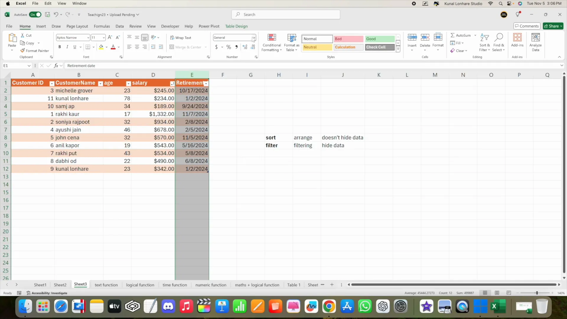
Step 12: Sorting and Filtering Data 📋
Sorting and filtering are fundamental techniques for managing data in Excel. They allow you to organize and view your data in a way that makes sense for your analysis.
Sorting Data
Sorting helps you arrange your data in either ascending or descending order. For example, you can sort a list of salaries from lowest to highest or vice versa. To sort, select your data range, go to the “Data” tab, and use the “Sort” feature. You can sort by any column, such as salary or age.

Additionally, you can sort by color if you’ve applied conditional formatting. For instance, if you’ve highlighted the top three salaries in red, you can sort your data to bring all red entries to the top.
Filtering Data
Filtering allows you to hide data that doesn’t meet certain criteria. For example, if you want to see only the entries with salaries over $50,000, you can apply a filter. Click on the filter button in the Data tab, choose the column you want to filter, and set your criteria.

Filtering is particularly useful for large datasets, as it enables you to focus on specific segments of data without losing the overall structure. Remember, filtering hides data based on your criteria, while sorting merely reorders it.
Step 13: Advanced Data Analysis Techniques 📊
Once you’ve mastered the basics of Excel, you can explore more advanced data analysis techniques. These include using PivotTables, advanced formulas, and data models.
Using PivotTables
PivotTables are a powerful tool for summarizing and analyzing large datasets. They allow you to quickly aggregate data, find trends, and create insightful reports. To create a PivotTable, select your data range, go to the “Insert” tab, and click on “PivotTable.”
In the PivotTable Field List, you can drag and drop fields to arrange your data as needed. For instance, you might want to analyze total sales by region or average age by department.
Advanced Formulas
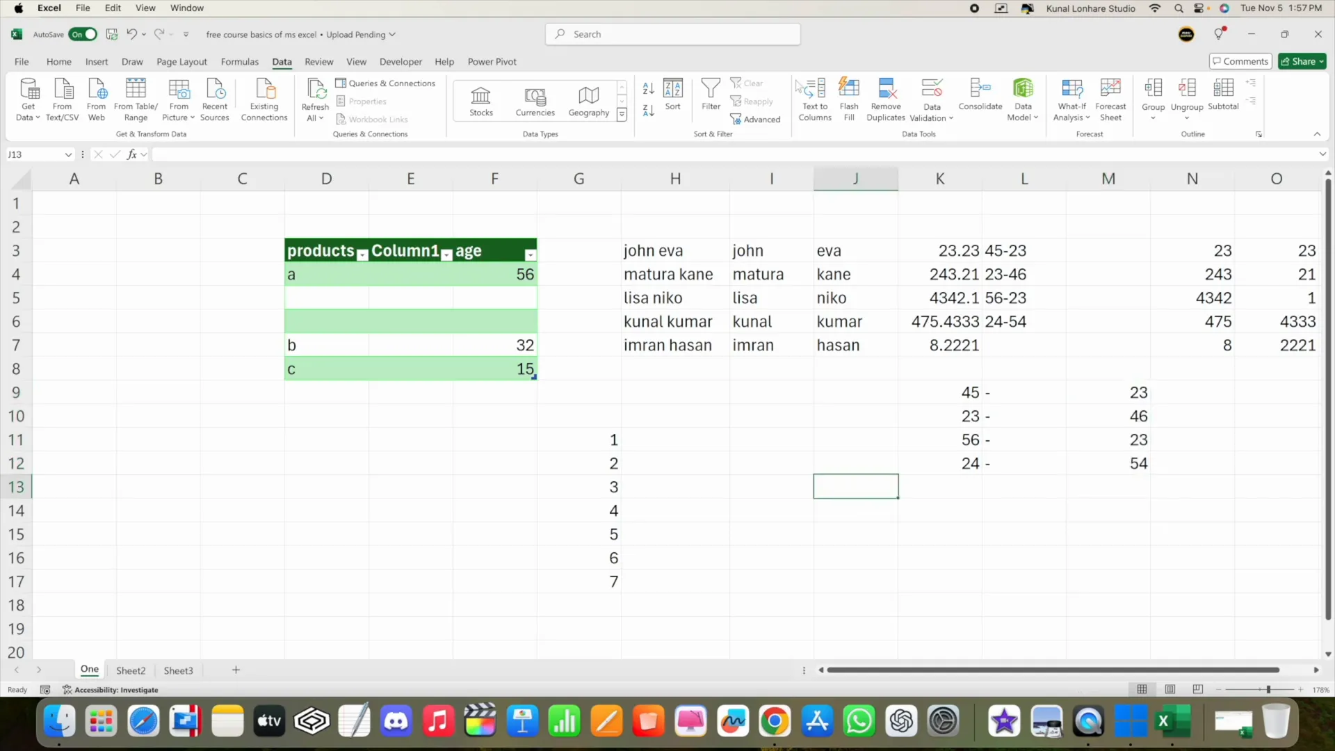
Utilizing advanced formulas such as VLOOKUP, INDEX, and MATCH can enhance your data analysis capabilities. These functions allow you to extract data from large datasets efficiently. For example, VLOOKUP can help you find specific values based on a lookup value.
Step 14: Utilizing ChatGPT for Data Analysis 🤖
Integrating AI tools like ChatGPT into your data analysis workflow can significantly enhance productivity. You can use ChatGPT to understand complex Excel functions, troubleshoot issues, or even generate insights from your data.
Learning Functions
When you’re unsure how a function works, simply ask ChatGPT. For example, you can request an explanation of the AVERAGE function and get detailed guidance, including syntax and examples.
Analyzing Data
You can also take screenshots of your Excel sheets and share them with ChatGPT to identify potential issues or errors in your data. For instance, if you suspect duplicate entries, ChatGPT can help you pinpoint them and suggest methods for removal.
FAQ: Common Questions about Data Analytics ❓
Q1: What is data analytics?
A1: Data analytics involves examining datasets to draw conclusions about the information they contain. It utilizes various techniques and tools to uncover patterns and insights.
Q2: Do I need programming skills for data analytics?
A2: While programming skills can be beneficial, they are not always necessary for entry-level data analytics roles. Familiarity with Excel and analytical tools is often sufficient.
Q3: How can I improve my data analytics skills?
A3: Taking a structured data analytics course, practicing with real datasets, and utilizing tools like Excel and ChatGPT can help enhance your skills. Continuous learning is key in this field.
Q4: What tools should I learn for data analytics?
A4: Essential tools include Excel, SQL, Python, and data visualization tools like Tableau or Power BI. Familiarity with these tools will greatly enhance your data analytics capabilities.